GC-MS
Published over 9 years ago. See the latest and most current information on GC-MS.
In celebration of its 250th birthday, the cognac distiller Hennessy has come up with a new design for its bottle and packaging created by scientific artwork maverick Peter Saville. The finished product — a follow-up to Saville’s collaboration with the brand in 2014 — draws inspiration from an unusual source — chromatography.
Saville is a renowned British art director who has cultivated a reputation for pushing back the boundaries of the art world and creating every more innovative designs — founded upon the deep-seated relationship between science and art. He does this primarily by transforming raw analytical data into a visual and cultural language which can be appreciated by all.
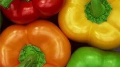
In this particular project, Saville has developed a design for the V.S.O.P. Privilege Limited Edition bottle in the Hennessy range. He has outdone himself again, by using the practice of chromatography to map out a visual spectrum of the molecular makeup of the liqueur. Chromatography works by separating a compound into its individual components. This can be visualised by assigning each component a place on the colour spectrum — which has led to Saville’s ultimately eye-catching design.
In keeping with his signature technique, Saville has used visual art to depict an abstract scientific idea — by transposing the individual elements of the cognac into a graphic design.
“This dynamic composition of elements is the interpretation of the real, scientific data within the V.S.O.P blend,” he explains. “The 2015 Hennessy V.S.O.P Privilège Limited Edition shows what V.S.O.P would look like if we were able to stand inside the very structure of the cognac’s blend. What one immediately observes is that there is a very constructivist connotation to the V.S.O.P blend: its material properties and its large presence both come into play.”
In the creation of his masterpiece, Saville identified several key colours and hues, assigning each of them roles in the makeup of the beverage. The reds and oranges communicate the heat of the drink as it slides down your throat, for example; the Verdigris undertones suggest a coppery element while the Prussian blue imbues the design with the sharpness and precision of science.
While this may be one of the first times that chromatography has helped to design the packaging for alcohol, it’s certainly no stranger to increasing the aestheticism and attraction of various intoxicating beverages.
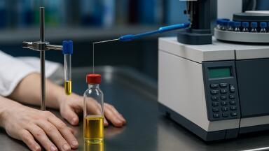
For example, the world-renowned brand of Jägermeister is regularly tested using gas chromatography (GC), mass spectrometry (MS) and high performance liquid chromatography (HPLC) in order to ensure an inimitable quality that you can taste.
The ability of a brewer to know what compounds form the flavour and aroma profiles of their various beers is discussed in the article, The Benefits of GC/MS Coupled with a Headspace Trap to Monitor Volatile Organic Compounds in the Production of Beer.
As such, when it comes to having a tipple, chromatography is doing its very best to keep us all in high spirits.
Photo via Wikimedia Commons


.jpg)